• Welcome, guest!

    This is a forum devoted to discussion of Wolverhampton Wanderers.
    Why not sign up and contribute? Registered members get a fully ad-free experience!

New kits 2025/26

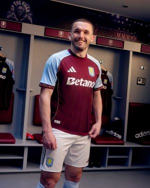
Pinstripes are immaculate always, but that shirt has too much else going on, even just red and white.
We’ll have to agree to disagree. They have no place on a football shirt and look awful on shirts and suits!
 
I think the cultural force of the Yankees of the late 90s ingrained loving pinstripes into me.
 
y04egzimqohcinxd6ibv.png


God, the 80s were so weird. That shade of yellow is a lot, even for me.

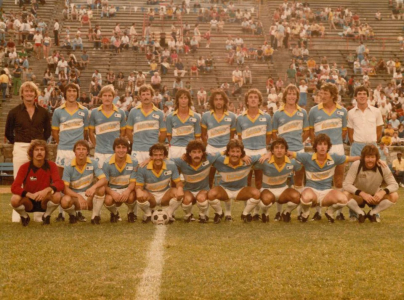
Here's the inspiration (get a load of these early 80s hairdos!):

1752684124249.png

Shout outs to the Carolina Lightnin'.
 
Isn't it green??
That's confusing me a bit, given the Lightnin' were 100% yellow; no room for interpretation. I'm hoping that the green in the modern "throwback" is some kind of color grade error... But somehow I doubt it.
 
That’s quite nice. Zaha looks like he’s being held to ransom though and has to wear it in order to facilitate his release.
He looks so unbelievably perplexed by the whole thing. Meanwhile, I’m unbelievably perplexed with his output relative to his wages, so who’s the real loser?

Me. It’s me.
 
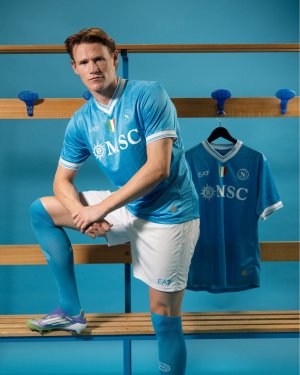
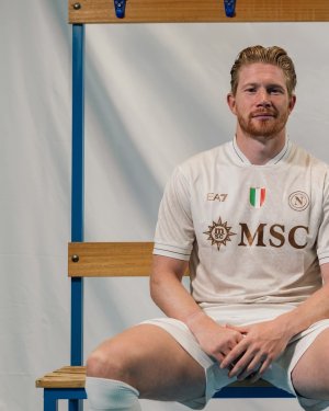
Napoli: off-white Leeds kit, looks like it's been through the wash with some dirty rags. Logos and badges are ugly too.

Dirty Leeds.
 
Last edited:
Napoli: off-white Leeds kit, looks like it's been through the wash with some dirty rags. Logos and badges are ugly too.
Ship this take off to the South Pole where it can be in an environment as cold as it is.
 
Back
Top