You are using an out of date browser. It may not display this or other websites correctly.
You should upgrade or use an alternative browser.
You should upgrade or use an alternative browser.
New Kit
- Thread starter machin05
- Start date

machin05
MURDERS BADGERS. PTG Dogsbody and Spreadsheet Mast
- Joined
- Apr 26, 2011
- Messages
- 33,755
- Reaction score
- 799
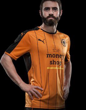
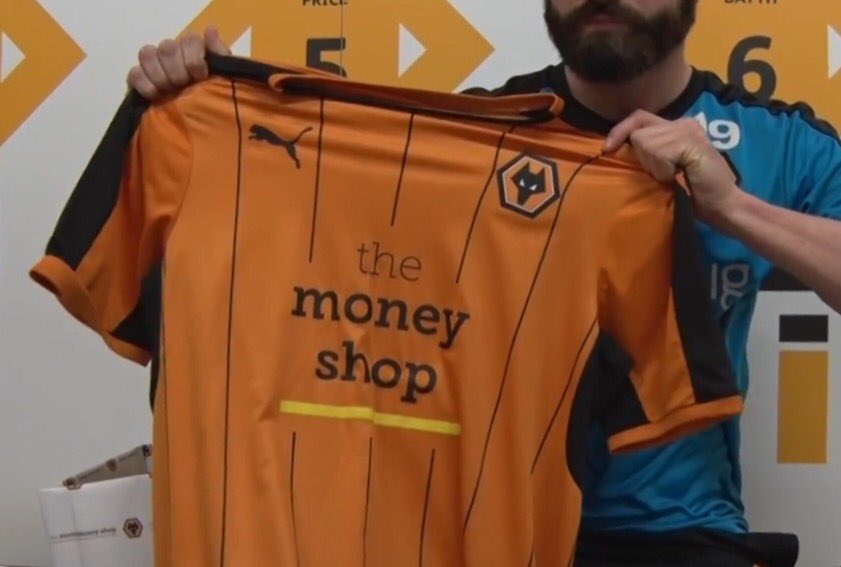
I don't mind the kit, I'd say it's alright but I wish the logo was a bit more discreet especially with quite a few disliking the sponser!
Can't imagine any sponsor being happy with a "discreet" logo tbh. Also, your suggestion would require Jez Moxey giving the slightest of a fuck about the fans.
North West Wanderer
Active member
- Joined
- Nov 22, 2009
- Messages
- 6,309
- Reaction score
- 12
Could have been a lot worse.
Let's face it no one is ever happy with the kit.
Let's face it no one is ever happy with the kit.
wanderer89
Well-known member
- Joined
- Jan 18, 2010
- Messages
- 4,770
- Reaction score
- 228
Why do we have our badge on the new Hull strip?
Deutsch Wolf
aka Dawn
- Joined
- Oct 16, 2009
- Messages
- 107,203
- Reaction score
- 31,326
I don't mind it, obviously the sponsor is shit with a shit 80s typewriter logo.
- Joined
- Oct 5, 2010
- Messages
- 20,613
- Reaction score
- 4,973
Why the yellow strip underneath the money shop logo? Any sponsor should be forced to have their name and logo in black only.
An improvement on last seasons belly button neckline strip. Still won't buy one to wear though.
An improvement on last seasons belly button neckline strip. Still won't buy one to wear though.
North West Wanderer
Active member
- Joined
- Nov 22, 2009
- Messages
- 6,309
- Reaction score
- 12
I don't mind it, obviously the sponsor is shit with a shit 80s typewriter logo.
Retro [emoji41]
Derby Wolf
Well-known member
- Joined
- May 8, 2015
- Messages
- 5,677
- Reaction score
- 3,777
I quite like it. Shame it won't be bought with that shit on the front.
Similar threads
- Replies
- 121
- Views
- 4K