• Welcome, guest!

    This is a forum devoted to discussion of Wolverhampton Wanderers.
    Why not sign up and contribute? Registered members get a fully ad-free experience!

New Kit Thread - slag off what you want in here

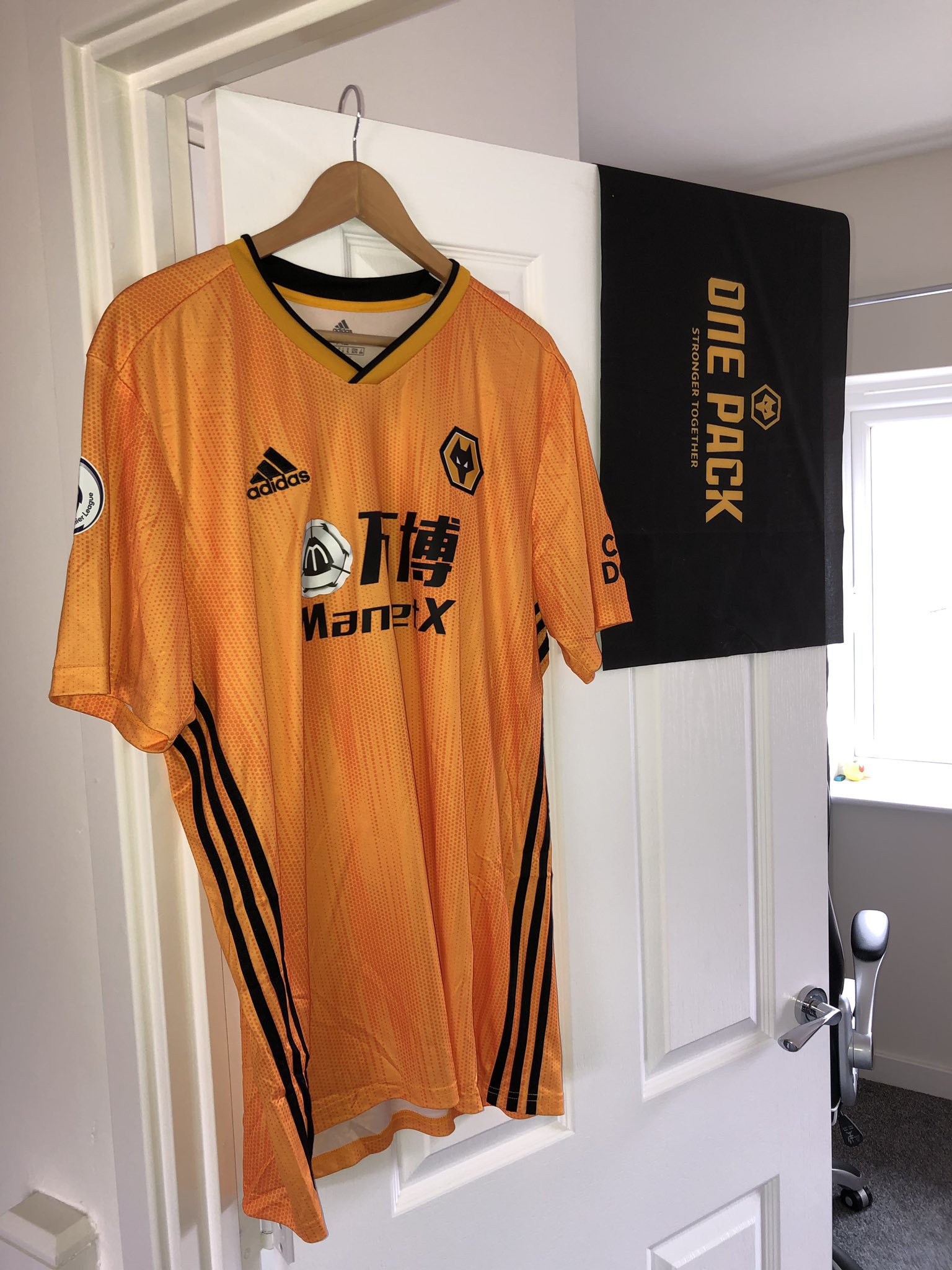
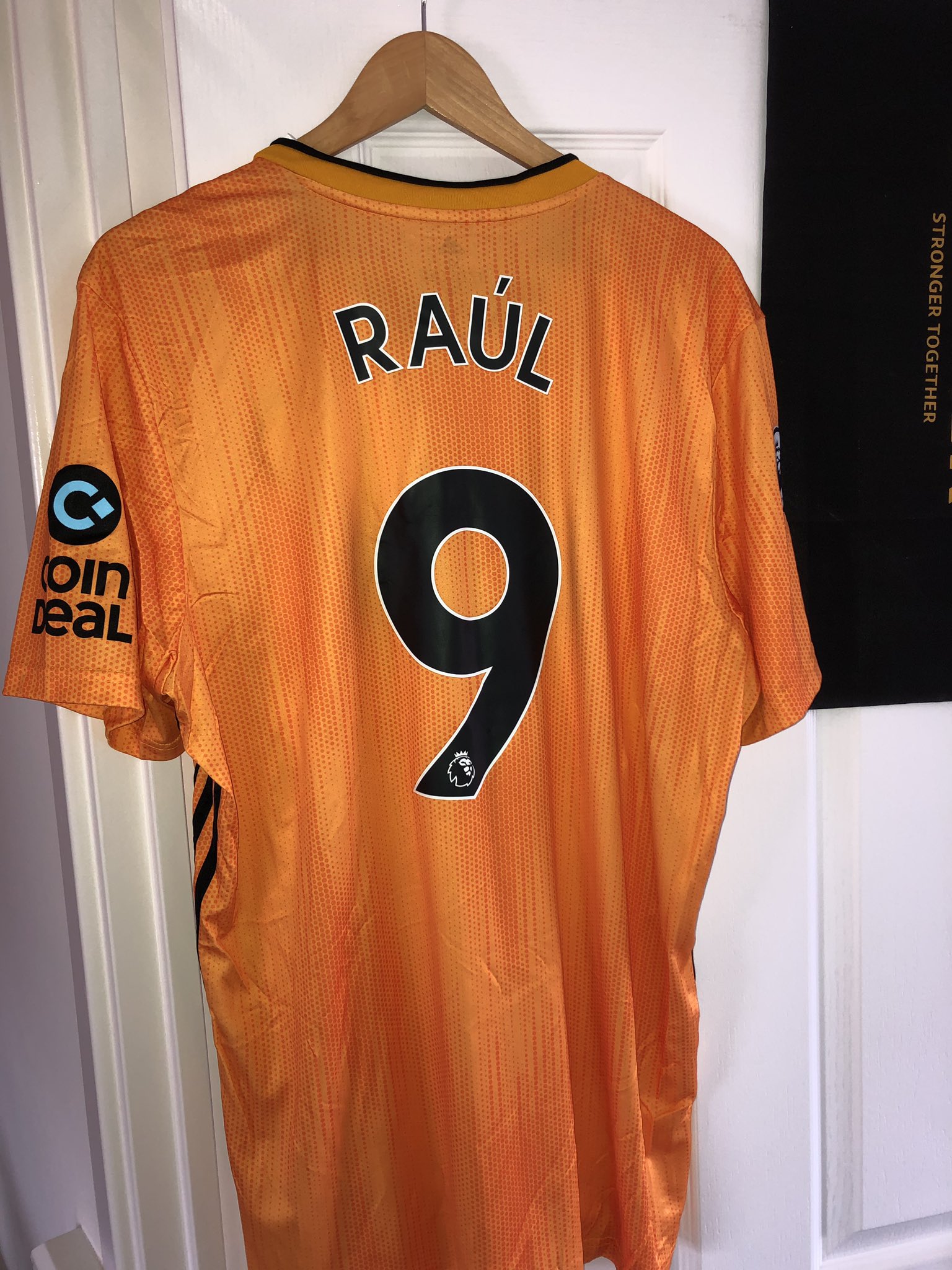
I've read somewhere that 2xl is the limited with the new kit, looks like I'm missing these two tops and knuckling down to getting another stone off for next season.

Sent from my SM-G950F using Tapatalk

Someone on The Mix saying he's heard the shirt is of a generous fit and to order a size below what you had last season
 
I'll wait till they come into the club shop and try one on. Cheers G.

Sent from my SM-G950F using Tapatalk
 
Won't be bothering with this one, funnily enough I don't mind the collar, it's just the rest of it that's shit.
 
That picture does it no favours at all!

If mine arrives and I am of the same opinion as how it looks in that picture it will be going back.
 
That looks awful. That's not yellow and it's not even remotely old gold. It's closer to Blackpool's orange than anything
 
It's been a while since we had a truly awful kit.
 
Hopefully the chap that says that it is a fake is spot on
 
There's also these photos from Twitter

Looks fine to me

D_BxGhSWkAAfUKY


D_BxGhRW4AEE9q4
 
The sweetcorn / maize does seem a bit of an odd juxtaposition
 
It's looks very orange, seems more of a Hull kit.
 
Not a fan of it at all. Not a patch on last seasons.
 
Each to their own, but we've had far worse kits over the years.

I still think it's pretty decent (sponsor aside). I agree it's not as good as last year's but overall it's a perfectly decent shirt. Assuming of course that the tweet posted earlier turns out to be a shit photo or a fake.
 
Why have we gone back to orange? Thats the real disappointment for me

I don't normally buy tops, last years was the first since I was a child, I won't be buying this one for myself but I'm sure the kids will be wanting them
 
It’s almost as bad some of the Burrda offerings. The colour is hideous. They had that perfect last year so don’t fuck with it. The collar and badge colours being last years shows the huge error in pantone. The pattern is awful and adds absolutely fucking nothing apart from making it bloody worse. The sponsor logo is shit as well.

Apart from that, a triumph.
 
Back
Top