You are using an out of date browser. It may not display this or other websites correctly.
You should upgrade or use an alternative browser.
You should upgrade or use an alternative browser.
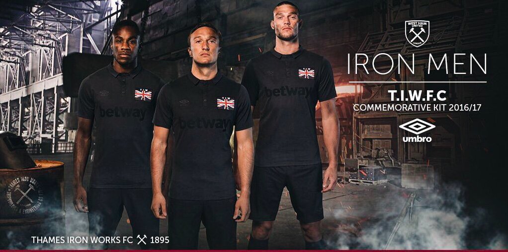
New Kits 2016/17
- Thread starter Deutsch Wolf
- Start date
Johnny75
Virtual Cock
- Joined
- Oct 24, 2011
- Messages
- 36,291
- Reaction score
- 12,474
The keeper kit is alright, but green and yellow should never be used that way.
I worry about you sometimes.
Alan
…unlucky Del - No chance 😉
- Joined
- Nov 30, 2012
- Messages
- 45,172
- Reaction score
- 13,213
I worry about you sometimes.
Black/orange/crimson reminds me of autumn leaves. I'm a sucker for it.
Not like I disagree with the awfulness of the outfield shirt!
Parkins left foot
'Quirk's Gay Game Winner'
- Joined
- May 11, 2012
- Messages
- 20,569
- Reaction score
- 422
I'm with Alan, that keeper kit is OK (well it is in comparison to the outfield one)
Jinky
Typical Fosun
- Joined
- Oct 28, 2009
- Messages
- 35,969
- Reaction score
- 9,488
Ladies, gentlemen and Jinky
:icon_lol:
wanderer89
Well-known member
- Joined
- Jan 18, 2010
- Messages
- 5,022
- Reaction score
- 534
I think they're more like the old bus seat covers.
- Joined
- Nov 5, 2009
- Messages
- 53,268
- Reaction score
- 4,315
Albion's kit launch :icon_lol: :icon_lol:
https://twitter.com/MasaiLincoln/status/732511588557688833
What the fuck???!
https://twitter.com/MasaiLincoln/status/732511588557688833
What the fuck???!
Jinky
Typical Fosun
- Joined
- Oct 28, 2009
- Messages
- 35,969
- Reaction score
- 9,488
Albion's kit launch :icon_lol: :icon_lol:
https://twitter.com/MasaiLincoln/status/732511588557688833
What the fuck???!
What. The. Actual. Fuck.
My eyes :icon_lol:
Tyrannosaurus Dan
Colonel Sanders
- Joined
- Jan 20, 2012
- Messages
- 19,555
- Reaction score
- 3,625
:icon_lol: :icon_lol: :icon_lol:
I never want to watch that video again. Ever.
I never want to watch that video again. Ever.
Quirkafleeg
PSA Grade: 3
- Joined
- Oct 21, 2009
- Messages
- 25,998
- Reaction score
- 3,243
I hope we never commemorate Blakenhall St Lukes ;-)
Lupo
Well-known member
- Joined
- Apr 1, 2012
- Messages
- 7,873
- Reaction score
- 4,792
As gorgeous as this is, Italy only unveiled a new away kit in October of last year and have barely worn it

http://www.soccerstyle24.it/maglia-italia-trasferta-puma-2016-2017/
http://www.soccerstyle24.it/maglia-italia-trasferta-puma-2016-2017/
machin05
MURDERS BADGERS. PTG Dogsbody and Spreadsheet Mast
- Joined
- Apr 26, 2011
- Messages
- 33,941
- Reaction score
- 946
Similar threads
- Replies
- 237
- Views
- 18K
D