Newbridge Wolf
Well-known member
- Joined
- Jan 15, 2010
- Messages
- 5,432
- Reaction score
- 901
Obviously it was a cloudy day...
£75m deal to cover the tax breaks in the Neymar and Messi deals.
Yeah, clean, simple. Far better than they deserve.

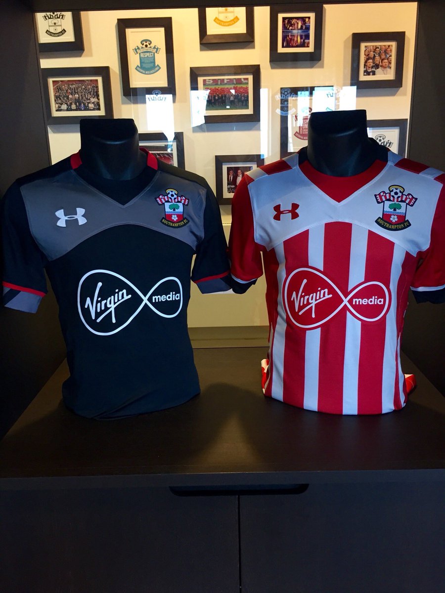
Sponsor looks dreadful on that, though.
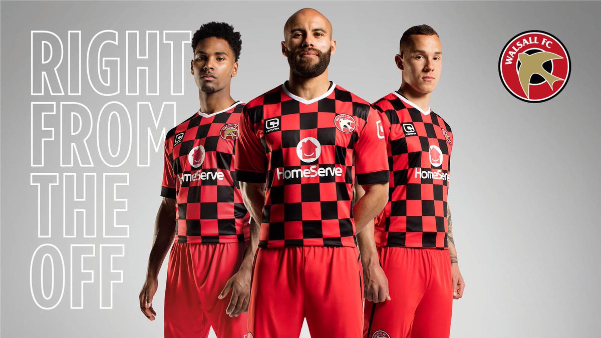
Monochrome kits are for the birds.


Most depressing kit of 2016/17 goes to Morton.
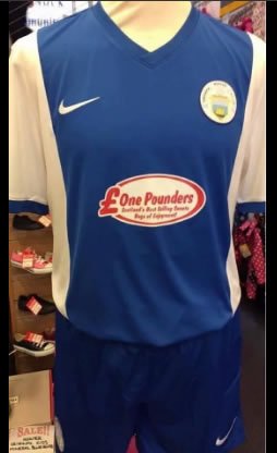
And here I thought it would have a big middle finger on it.Morton release a new shirt following fan backlash to this
http://www.footballkitnews.com/18992/morton-reveal-new-kit-for-201617-after-scrapping-old-one-due-to-fan-backlash/
I kinda like it...