Paddingtonwolf
Flaming Galah
- Joined
- Oct 30, 2009
- Messages
- 76,918
- Reaction score
- 7,456
Need to see it in the flesh but for me the colour change is a big mis-step. I don’t think I like it very much sadly
Apart from the sponsor, I can't see what there is to hate about it. It's a pretty plain design. It could have been a lot worse.
It's not changed colour.
Look closely, it's the same colour underneath but with a darker pattern.
It's not changed colour.
It's probably because of what I do for a living but:
The V-neck collar with a black band around it to separate the shirt from the wearer but this appears nowhere else on the top (sleeves or bottom)
The collar is a different colour to the rest of the strip and again this doesn't appear on the sleeves or bottom of the strip
The Adidas stripes down the side are from the armpit to the shorts, which then do not carry on the design but merely stop making the shirt and shorts look like they don't match
The pattern of the top makes the colour wash in and out like a terrible tie-dye effort
The badge, sponsor and manufacturers logo are all in the top third of the shirt making the open space of the bottom look strange and empty whereas the top and sleeves look too busy
Other than that I agree with you, it could have been worse.
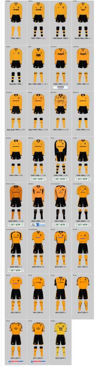
Home kit rankings 2003-present (can't be bothered to go back any further):
2018/19 - W88. Tremendous. Even with a betting sponsor.
2013/14 - Whathouse (League 1)
2015/16 - Silverbug
2008/09 - Classic Chaucer - Championship winning shirt
2019/20 - New kit
2014/15 - black sleeves Whathouse
2006-08 - early McCarthy era Chaucer
2017/18 - first Nuno home kit - appalling sponsor, nice shirt but I can't place it any higher
2004-06 - first Chaucer - tainted by Hoddle era
2009/10 - First SportingBet - awful sponsor but shirt was good quality
2010/11 - 2nd SportingBet
2002-04 - fucking Doritos
2016/17 - first Money Shop monstrosity - was never keen on this one and it reminds me of Paul Gladon
2011/12 - starting on the dregs now - awful relegation Roger Johnson Turrda shirt
2012/13 - The Saunders Shirt. A kit launched with a logo sewn on upside down, made of terrible quality material, a rubbish fit, a collar made of j-cloth, a shite sponsor - the only redeeming quality was that the sponsor peeled off easily. I was bought this shirt and it now sits in a cardboard box with the other old cloths I use for dusting
Jeez, you could have posted accompanying photos, you MONSTER!
I gave you descriptions - that should have been more than enough. Any #superfan would have only needed the dates.
Home kit rankings 2003-present (can't be bothered to go back any further):
2018/19 - W88. Tremendous. Even with a betting sponsor.
2013/14 - Whathouse (League 1)
2015/16 - Silverbug
2008/09 - Classic Chaucer - Championship winning shirt
2019/20 - New kit
2014/15 - black sleeves Whathouse
2006-08 - early McCarthy era Chaucer
2017/18 - first Nuno home kit - appalling sponsor, nice shirt but I can't place it any higher
2004-06 - first Chaucer - tainted by Hoddle era
2009/10 - First SportingBet - awful sponsor but shirt was good quality
2010/11 - 2nd SportingBet
2002-04 - fucking Doritos
2016/17 - first Money Shop monstrosity - was never keen on this one and it reminds me of Paul Gladon
2011/12 - starting on the dregs now - awful relegation Roger Johnson Turrda shirt
2012/13 - The Saunders Shirt. A kit launched with a logo sewn on upside down, made of terrible quality material, a rubbish fit, a collar made of j-cloth, a shite sponsor - the only redeeming quality was that the sponsor peeled off easily. I was bought this shirt and it now sits in a cardboard box with the other old cloths I use for dusting
I gave you descriptions - that should have been more than enough. Any #superfan would have only needed the dates.