- Joined
- Oct 3, 2010
- Messages
- 24,929
- Reaction score
- 3,775
They play in stripes.


Yellow on white doesn't go.

The bird$#@! kit.
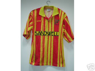
$#@!ing lol. Legend has it that Bobby Gould had input into this one when he was manager. Wanted them to be inspired by Melchester Rovers. They got relegated to the third tier.
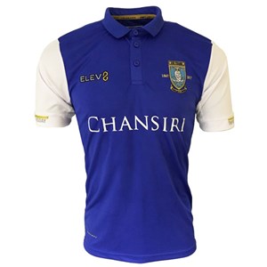
A current day one. Dear Sheffield Wednesday, can you stop looking like Ipswich please? Thanks.
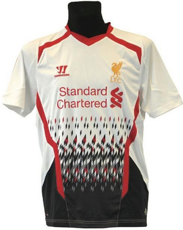
Looks like a 1990s inkjet printer has flipped its lid and gone off one one.
Sounds like semantics to me.
There have been some real crackers for Keepers kits over the years. Campos of Mexico was the worst-These all set off migraines!
View attachment 2042
View attachment 2043
View attachment 2044
View attachment 2045
Not really, "they play in stripes traditionally" and "they are not wearing stripes" is not a semantic debate. It's an either/or question.
In of itself it's still not a very good kit, it looks cheap as $#@!, but beyond anything else it isn't a Sheffield Wednesday kit. No more than it would look like a Wolves kit if we suddenly adopted a massive black sash across the middle of our shirt, or decided to play in gold and black quarters.
That is a stripe. Vertical isn't a sash.
Also you can do what you want with away kits and they can be judged on their own individual merit.
Home kits are sacrosanct. Or should be.[/QUOTE
Totally agree, although my preference for wolves away would be all white with a bit of trim on collars cuffs etc.
Prefer home and away without advertising as well, hey, we don't even need the £4,000,000 these days or whatever the deal is.
Leicester's leaked new away kit.
